It all begins
with an idea
Natural carbonation
This was a brief by Petaluma wines to develop a headline for their Pét-Nat wine (sparkling from natural fermentation as opposed to modern carbonation) which has a slight pink tint to it from adding a splash of their very own Pinot wine.
Art Director: NAC and ME
The following concepts are my own ideas and are not owned by the brands themselves.
Luxury Olympics
Developed purely for the fun of it, this concept was a playful way to advertise the Olympics in Paris 2024. Paris, also being the birthplace of the Chanel brand. Instead of the iconic Chanel C’s, the Olympic Rings have made their way in.
The campaign could extend in store as well, with products temporarily renamed to match lyrics of some of the songs.
The decor inside Itsu leans into the iridescent and holographic pinks that are very popular with the Taylor Swift fans. “And all I feel in my stomach is butterflies.”
Itsme, Hi!
Concept for ITSU Wembley Park for a Taylor Swift Concert activation.
As the lyrics to the TS song go: “It’s me, hi, I’m the problem it’s me", this concept was pitched to Itsu ahead of Taylor Swift’s second set of concerts in Wembley, London.
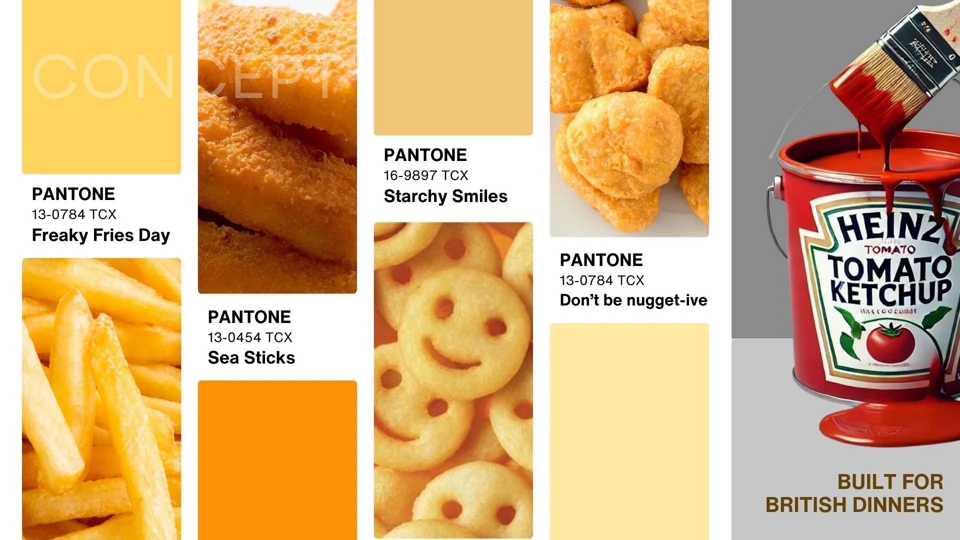
British Dinner
A concept for Heinz Tomato Ketchup - playing on the idea of this food (mostly consumed by young children on a school night) being typically "Beige".
Bangers and mash, fish and chips and pies are also part of this collection.
A suggested and unconventional brand partnership between Heinz and Pantone.
Let Them!
Toddlers are going touch, and lick surfaces, and occasionally eat food off the floor.
Let them, by using Neat products around the house. Neat products are all non-toxic, child and pet friendly.
The images depict different scenarios by which different products would be advertised.
Party at Seaworld
What’s lurking in the water? Something frightening, or something inviting?
Concept for Sea World, inviting visitors to book their birthday parties there.
Rock ‘n’ Ramen
Concepts for social media and signage in front of shop, a concept for Bone Daddies with ramen noodles in the shape of the well-recognised rock hand symbol.
Bone Daddies has forever been describing their ramen as “Rock n Roll” with decor and music in-store reflecting just this.


